Core guide
How do you check whether a mobile casino page is usable?
Follow a rules-reading task through touch, zoom and orientation, with a clear observation record and an interactive target-size illustration.
Start with a reading task, not the home screen
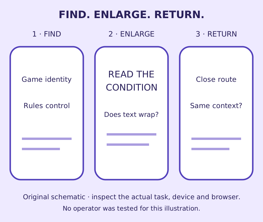
A polished mobile opening screen tells you little about the page someone needs three steps later. A useful first task is to find a named game’s rules, identify one condition, enlarge the explanation and return to the original place. That sequence follows information through several changes without requiring a deposit, wager or account registration.
Write down the device, browser and date before beginning. Add the route attempted and the point at which you stopped. If a sign-in wall prevents further observation, that is part of the result. Do not describe the unseen account screen as either usable or unusable. The record should distinguish a boundary in the research from a defect in the service.
This guide is a framework for observations, not a report of tests performed on named casinos. Its drawings are original schematics. The point is to replace an unexplained mobile score with a clear account of one task: what was visible, what changed and which question remains unanswered. That makes a small finding useful to another reader or reviewer.
Choose information that can be read without making a financial decision. A public explanation or help page is enough to examine text, menus and navigation. Completing a usability exercise should never depend on taking an offer or funding a casino account.
Separate the picture of a control from its active area
A small icon can sit inside a larger active target. Conversely, a large decorative background may contain a much smaller clickable region. A reduced marketing image cannot establish either relationship. An observation needs the actual control and the surrounding targets, with a clear statement of how its dimensions were identified.
W3C’s minimum pointer-target criterion uses 24 by 24 CSS pixels, subject to exceptions including sufficient spacing and certain other circumstances. That number should not become a blanket rule that every smaller-looking symbol fails. The active shape, neighbouring targets and applicable exception matter. Our focused target-size note introduces the distinction for a single control.
The interactive rectangle here answers only one geometric question: can an axis-aligned 24-by-24 square fit inside the stated rectangle? It does not know whether the real target has rounded corners, overlaps another control or qualifies for an exception. A result about that rectangle must therefore stay a result about that rectangle.
Record the action as well as the dimensions. An information control and a financial action have different consequences for a mistaken selection. This guide does not test either on an operator’s site. It shows why a useful observation names what could be confused, rather than reporting that an error happened when no such event was witnessed.
Sources: W3C: Target Size (Minimum).
Enter an illustrative rectangle’s width and height to see whether a 24-by-24 CSS-pixel square can fit.
Read the explanation after it changes size
Opening a rules panel is only the beginning. Enlarging its text may change line breaks, the position of a close control or the amount of content hidden beneath a fixed banner. Inspect the heading, the condition being read and the route out separately. A panel can keep one available while obscuring another.
W3C’s reflow criterion addresses information and functionality at an equivalent narrow viewport, with exceptions for content that needs a two-dimensional layout. A game board may raise different questions from the ordinary prose explaining it. Do not extend a board’s layout needs automatically to every help paragraph or account notice around it.
Record how the enlargement was performed. Mobile pinch zoom, a browser text setting and desktop viewport testing need not produce identical behaviour. A phone screenshot labelled 200% without an explanation of the setting leaves the next reviewer guessing about the condition that produced it.
Our zoom note provides a compact record for this stage. If a line cannot be read without moving sideways, describe the exact element and circumstances. Do not infer that every page behaves the same way. A reproducible narrow example is stronger than a broad conclusion based on a single cropped screen.
Sources: W3C: Reflow.
Orientation is a choice that needs its own observation
A person may hold a phone in portrait or landscape, or use a device mounted in one position. The W3C orientation criterion concerns restrictions to a single orientation unless that orientation is essential. It also distinguishes the author’s restriction from a device setting chosen by the user.
For the reading task, record which orientation was used and whether the content requires a change. Then note what happens to the explanation and controls in the other orientation if it can be checked. A layout can change without being locked. Those are separate observations, and they should not be compressed into one pass/fail statement.
Consider a fictional rules page that becomes wider in landscape but leaves the same words and close route available. That differs from a page that refuses to display until the phone is rotated. It also differs from an operating-system orientation lock the user enabled. Naming the cause avoids assigning the page responsibility for a device preference.
A wider view can make one part easier to read while reducing vertical space. Look for fixed headers, notices or browser controls that affect the available reading area. Record the result for the actual task and setup. This guide does not treat one comfortable orientation as evidence that every reader can use the same arrangement.
Sources: W3C: Orientation.
Watch what happens when a panel or keyboard appears
Small-screen interfaces change when a menu opens, a text field receives input or a help panel overlays the page. The important question is whether the current task remains understandable. A search field may still be visible while its result heading disappears above the keyboard. A close icon may remain on screen while its purpose is unclear.
Use harmless example text in a public search if appropriate, and avoid personal or payment details. Record the visible label before typing and the outcome afterwards. If the search has no results, note how that outcome is explained and whether the query can be changed. An empty result is not proof of a technical error.
The browser’s back control and an in-page close control may also produce different effects. Observe which context each restores rather than assuming they are interchangeable. Does the person return to the same card, the same list position or a fresh home screen? A change may be intentional, but it still needs to be described accurately.
Keep loading, completion and interruption states distinct. A spinner communicates activity only if the surrounding information makes its meaning clear. If the next state never appears during the observation, record the elapsed observation and uncertainty; do not invent a successful request or a failed account action from an unfinished display.
Make the observation table carry the evidence
Use a separate row for each change in the task: opening the rules, enlarging the text, rotating the device, showing the keyboard and returning. The table below supplies reference prompts, not a set of results. Copy these prompts into your own notes, leaving the findings blank until the relevant behaviour has been observed.
Distinguish three findings that are often mixed together. Shown means the relevant information was visible on the route examined. Not shown means it was not visible within that recorded route. Not checked means the observation was not performed. The last two categories cannot be merged without hiding the reason for the gap.
A useful note includes the exact text or control, the circumstances and the consequence that can actually be supported. For instance, a fictional panel’s final condition is covered by a fixed notice at one viewport. That does not prove a customer accepted different terms; it identifies an information problem to investigate.
If an issue cannot be reproduced, keep the original record and state the difference between attempts. A later successful observation does not erase the earlier one, but neither establishes how common the behaviour is. Frequency claims need a defined test programme, not two screenshots selected because they look persuasive.
| Change | Record | Leave separate |
|---|---|---|
| Open rules | Game identity, heading, route | Unseen account information |
| Enlarge content | Setting, viewport, covered text | Game-board layout needs |
| Change orientation | Chosen position and page response | Device orientation lock |
| Show keyboard | Field label and visible result | Any unperformed submission |
| Return | Destination and restored context | Assumptions about completion |
Finish with a bounded conclusion
The finished mobile note should identify the task completed, the parts that remain unclear and the evidence needed next. It need not contain a star rating. A clear explanation of where the reading route breaks can be more useful than a numerical summary that conceals untested account states.
The rectangle tool is educational, and the route diagram is schematic. Neither certifies a website’s accessibility. A complete assessment needs broader coverage and appropriate methods. What this guide offers is a practical starting point: inspect the real information, preserve the conditions of the observation and let the reader see exactly how the conclusion was reached.
When sharing the note, remove unrelated personal details from any permitted capture and explain any crop that affects context. Keep the source page and observation date attached. A reviewer should be able to distinguish the original screen from an annotated explanation, and a reported action from a suggested improvement. Those distinctions preserve the value of a small study even when its scope is deliberately limited.
Questions answered
Can a small casino icon have an adequate tap target?
Yes, the active region may be larger than the visible icon. The actual target, its shape and neighbours must be examined rather than inferred from a reduced image.
Does every small mobile control fail WCAG?
No. The minimum target-size criterion includes stated exceptions, including spacing. A geometric size check alone is not a complete criterion or accessibility verdict.
Is phone pinch zoom the same as a full reflow test?
Not necessarily. Record the device and exact enlargement method, and assess the relevant criterion with an appropriate setup rather than assuming identical behaviour.