Facts checked Article
Mobile casino usability
How do I use my mobile browser to zoom? Measured on a phone, with the method
Pinch the page, or raise the browser’s own zoom: Page Zoom in Safari, Default zoom in Chrome. Then check that nothing is lost at 200%, the WCAG 2.2 threshold.
How do I use my mobile browser to zoom? Two controls, one threshold (200%)
You have a casino rules page open on your phone, and the small print is too small to read. How do I use my mobile browser to fix that? Pinch the page with two fingers, or raise the browser’s own zoom setting.
Either way, the test is the same. At 200%, nothing on the page should be lost.
That threshold is not ours. It comes from WCAG 2.2, the W3C’s web accessibility standard, and we read it again on 23 September 2026.
Below are the controls for Safari on iPhone and Chrome on Android, in the words of Apple’s and Google’s own help pages. Every check here runs on public pages, logged out. No operator is measured or ranked.
Sources: W3C: Resize Text; Apple: Safari settings on iPhone; Google: Chrome zoom on Android.
The numbers this page works with
- Text size threshold
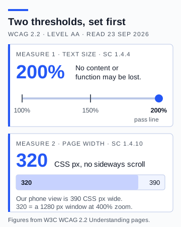
- 200%, without loss of content or functionality (WCAG 2.2 success criterion 1.4.4, Level AA).W3C: Resize Text · as checked on
- Page width threshold
- 320 CSS pixels with no scrolling in two directions (success criterion 1.4.10), the same as a 1280 CSS pixel window at 400% zoom.W3C: Reflow · as checked on
- Safari on iPhone
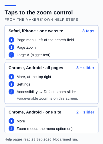
- The page menu button on the left of the search field, then Page Zoom, then the large A.Apple: Safari settings on iPhone · as checked on
- Chrome on Android
- More, then Settings, then Accessibility: a Default zoom slider and a Force-enable zoom switch.Google: Chrome zoom on Android · as checked on
Read on 23 September 2026. Each line names the page it came from.
Safari on iPhone — Page Zoom, 3 taps from the page
Apple’s iPhone User Guide puts the control next to the address. Tap the button on the left side of the search field, then tap Page Zoom. Tap the large A to make the text bigger, or the small A to make it smaller.
Apple files these steps under making content larger or smaller for a website. So the change is for the site you are on, not every site. A small indicator shows briefly when the size returns to 100%.
That is 3 taps to the first step up. We counted them from the steps as Apple publishes them. It is not a timed run on a phone.
Sources: Apple: Safari settings on iPhone.
Chrome on Android — Default zoom for every page, Page Zoom for one
Google’s Chrome help gives two routes. For every page, open Chrome and tap More at the top right. Then tap Settings, then Accessibility, and move the slider next to Default zoom until the preview text is easy to read.
For one site, tap More, then Zoom, and use the slider. Google’s tip says the level will be saved for that site and will not affect other sites. The Zoom item only appears in the menu after you turn on Show zoom option in main menu, on the same Accessibility screen.
That screen holds one more switch. Google’s wording is: ‘To zoom in on pages that prevent zoom, turn on Force-enable zoom.’ It matters for one reason, and a later section explains it.
Sources: Google: Chrome zoom on Android.
The zoom controls in the two phone browsers
| Question | Safari on iPhone | Chrome on Android | Evidence |
|---|---|---|---|
| Where the control is | Page menu button, left of the search field | More, Settings, Accessibility | · Apple: Safari settings on iPhone |
| What it changes | Text size for the website you are on | Default zoom for all pages; Page Zoom for one site | · Google: Chrome zoom on Android |
| Taps to the first step up | 3 | 3 and a slider (all pages); 2 and a slider (one site) | · Google: Chrome zoom on Android |
| Kept for one site only | Yes, set per website | Yes for Page Zoom, per Google’s tip | · Google: Chrome zoom on Android |
| Switch for pages that block zoom | Force-enable zoom | · Google: Chrome zoom on Android |
Blank means the help page we read does not say. It does not mean the browser cannot do it.
Font size or the whole page — 2 kinds of zoom, 2 results
The two browsers do not enlarge the same thing. Apple’s steps describe Page Zoom as a way to increase the font size. Google’s page describes Chrome’s zoom as a way to make everything on a web page larger or smaller.
W3C’s notes on text size name both kinds. They list zoom of the whole page, magnification, text-only resizing and a set size for text as ways a browser can scale content.
So the same casino page can pass on one phone and fail on another. A layout that copes with bigger text may still break when every box grows with it. Record which kind of zoom you used, every time.
Sources: Apple: Safari settings on iPhone; Google: Chrome zoom on Android; W3C: Resize Text.
Text size — 200% (threshold from WCAG 1.4.4)
The first threshold is about text. It is short enough to quote in full, and the quotation below does so.
W3C’s own notes say that scaling content is mainly the job of the user agent. In plain terms, that means the browser. So the zoom controls above are the right tools for this test.
The pass line is simple. At 200%, every sentence and control that was there at 100% must still be there and still work. Text that is cut off, lines that overlap, or a button that has gone is a fail.
Sources: W3C: Resize Text.
The criterion, word for word
Except for captions and images of text, text can be resized without assistive technology up to 200 percent without loss of content or functionality.
Page width — 320 CSS px with no sideways scrolling (WCAG 1.4.10)
WCAG 2.2’s reflow criterion addresses content at a width equivalent to 320 CSS pixels for vertically scrolling pages, with exceptions for content that needs a two-dimensional layout.
W3C gives the scale. A width of 320 CSS pixels is the same as a window 1280 CSS pixels wide at 400% zoom. Our phone view is 390 CSS pixels wide, so the page must still work when narrowed further.
The exceptions matter on a casino site. W3C’s list names maps, diagrams, video, games and data tables.
A game board may raise different layout questions from its surrounding rules or account information. State which part of the page was examined.
Sources: W3C: WCAG 2.2; W3C: Reflow.
Zoom blocked — the viewport tag decides (2 expectations)
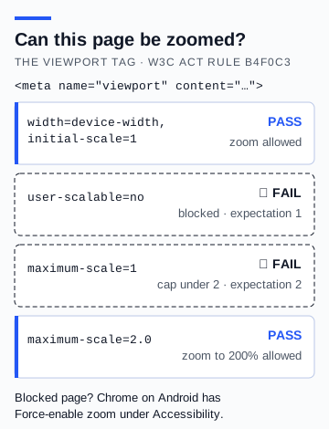
A page can stop pinch-zoom with one line of code. It is called the viewport meta tag, and it sits in the page’s header where you cannot see it.
W3C has a test rule for it, called Meta viewport allows for zoom. It fails a tag that sets user-scalable to no. It also fails a tag that sets maximum-scale below 2, because that caps zoom under 200%.
A tag with maximum-scale=2.0 passes, and the rule uses it as one of its own examples.
The rule is careful in one respect. A page that fails it may still meet the 200% and reflow criteria by other means. So a blocked tag is a finding to record, not a verdict on its own.
On Android, Chrome’s Force-enable zoom is the way round a blocked tag. The Safari help page we read does not describe a matching switch. On an iPhone, the phone’s own Zoom is the fallback, and the next section covers it.
Sources: W3C: viewport zoom rule; Google: Chrome zoom on Android; Apple: Safari settings on iPhone.
When the page will not zoom — the phone’s own Zoom (iPhone)
There is one more tool if a page blocks pinch-zoom on an iPhone. Apple’s iPhone User Guide describes a Zoom feature that can magnify the screen no matter what you are doing.
Go to Settings, then Accessibility, then Zoom, and turn it on. Then double-tap the screen with three fingers. You can magnify the entire screen or just part of it with a movable lens, and you move around by dragging with three fingers.
This enlarges the screen, not the page. The page does not rewrap its text, so it is a fallback for reading, not a pass on the 200% test.
Sources: Apple: Zoom on iPhone.
What should survive the zoom — the reading task
A mobile review can begin with an ordinary task: find the game’s rules, enlarge the text, and return to the same place. Check whether a heading, a payout condition, and the close control remain available.
The purpose is to understand how the interface behaves, not to assume that a polished opening screen guarantees usable detail pages.
Rules pages matter for a reason set in regulation. RTS 3 (one of the Gambling Commission’s remote technical standards) says an explanation of the rules must be easily available to the customer before they commit to gamble. If you need 200% to read it, zoom is how you reach it.
Sources: Gambling Commission: RTS 3.
Five things that should still be there at 200%
Tick each one on the public page, logged out. Ticks stay in your browser.
- The deposit-limit link on the homepage, visible and working.
Ticks are kept only in this browser and are never sent anywhere.
The deposit-limit link at 200% — visible or not
One control deserves its own check. RTS 12, the Commission’s technical standard on financial limits, says financial limit facilities ‘must be provided via a direct link on the homepage and be clearly visible and accessible’.
The same standard says the system ‘must minimise the number of clicks or pages customers make in order to access financial limit facilities’. Zoom can undo that. At 200%, a menu may fold away or move the link off the screen.
So open the public homepage, zoom to 200%, and look for the link. Record whether it is visible and where it leads when tapped. Logged out, it may lead to a sign-in page; record that and stop there.
How many taps a control takes matters most on the night you need it. If that night is now, GamCare is on 0808 8020 133 and GamStop is at gamstop.co.uk.
Sources: Gambling Commission: RTS 12; Gambling Commission: self-exclusion; GamStop.
Method: repeat this on your own phone
If you have been asking how do I use my mobile browser to read small print, the six steps below are the whole answer. They use only the phone and the browser already on it, and each step ends with something written down.
What the result means: a pass says the page kept its words and controls at your size, on that day, on that phone. A fail names the item that was lost. Neither result says anything about the games or the operator’s licence.
How to test zoom on a casino page, logged out
Six steps. Write the result of each one down before moving on.
Write down the set-up
Note the phone model, its software version, the browser and its version, and the date. Hold the phone upright. Stay logged out.
Open the page at 100%
Open the public rules or help page. Note the heading, one payout or return-to-player line, and the close control.
Raise the zoom to 200%
In Safari, use Page Zoom and the large A. In Chrome, move the Default zoom slider. Stop at 200%, or as close as the browser allows, and record the figure you reached.
Read the same three items
Scroll down only. Record any line that needs sideways scrolling, any text cut off, and any control that has gone.
Try a pinch
Reset to 100% and pinch the page. Record whether it zooms. In Chrome, if it does not, turn on Force-enable zoom and try again.
Check the deposit-limit link
Open the homepage at 200%. Record whether the link is visible, and where it leads when tapped.
Keep a precise record — one row per measure
Note the viewport, zoom setting, orientation, and any obscured text or control. Distinguish a design limitation from an issue you could not reproduce.
A reader can learn more from one clearly documented example than from an unexplained mobile score attached to an entire casino. The sheet below keeps each finding as one row, with its threshold and where that threshold comes from.
The zoom record sheet
| Measure | Threshold | Where it comes from | Your result | Evidence |
|---|---|---|---|---|
| Text at 200% | Nothing lost | WCAG 1.4.4 | · W3C: Resize Text | |
| Width at 320 CSS px | No sideways scroll | WCAG 1.4.10 | · W3C: Reflow | |
| Pinch-zoom | Allowed, to at least 200% | W3C rule b4f0c3 | · W3C: viewport zoom rule | |
| Deposit-limit link at 200% | Visible from the homepage | RTS 12, applied at zoom | · Gambling Commission: RTS 12 |
Print it or copy it. Leave a row blank if the page was never reached, and say why.
What this inspection did not cover
This note measures the browser. It does not test text size inside an installed app, where the phone’s own text setting does that job. The scored app-versus-browser sheet covers both routes side by side.
Button size is measured separately, with its own threshold. So is one-handed reach, the question of which controls sit under your thumb.
No operator was measured for this note, so it names none and ranks none. When the lab publishes a zoom result, it will carry the filled-in sheet and the date.
The words this page uses narrowly
- Viewport
- The part of a web page the phone shows at once. Our test view is 390 CSS pixels wide.
- Reflow
- Text rewrapping into one column as it grows, so you only scroll up and down.
- Page Zoom
- The zoom control in Safari on iPhone and, for one site at a time, in Chrome on Android.
- Force-enable zoom
- A Chrome for Android setting that lets you zoom pages that try to prevent it.
Questions answered
How do I use my mobile browser to zoom in?
Pinch the page with two fingers, or use the browser’s setting. In Safari on iPhone, tap the button on the left of the search field, then Page Zoom, then the large A. In Chrome on Android, tap More, Settings, Accessibility and move the Default zoom slider. Steps read on 23 September 2026.
Why will a casino page not let me pinch-zoom?
The page’s viewport tag may set user-scalable to no, or cap maximum-scale below 2. W3C’s test rule treats both as failures. In Chrome on Android, turning on Force-enable zoom lets you zoom anyway. On an iPhone, the Zoom setting under Accessibility magnifies the whole screen, though the page itself does not rewrap.
What should still work at 200% zoom?
Everything that worked at 100%: the heading, the rules text, a payout or return-to-player line, the close control and the deposit-limit link. WCAG 1.4.4 asks for no loss of content or functionality at 200%.
Is a page that blocks zoom breaking the law?
WCAG is a web standard, not UK gambling law, and we do not claim a legal breach. W3C’s rule records a blocked tag as a failed test, and notes that a page may still meet the 200% criterion by other means. We report the result against the threshold and name its source.
Does browser zoom work the same way in a casino app?
No. An installed app generally has no pinch-zoom, so the phone’s own text-size setting does that job. This note tests the browser only; the app-versus-browser sheet on this site covers both routes.
Accessibility sources
- Web Content Accessibility Guidelines 2.2
- Understanding Success Criterion 1.4.4: Resize Text
- Understanding Success Criterion 1.4.10: Reflow
- Meta viewport allows for zoom (ACT rule b4f0c3)
- Customize your Safari settings on iPhone
- Zoom in on the iPhone screen
- Change text, image and video sizes (zoom) - Android
- RTS 3: Rules, game descriptions and the likelihood of winning
- RTS 12: Financial limits
- Self-exclusion
- GamStop
Continue reading

Small buttons deserve a clear test
A mobile control's visible icon and its tappable area are not always the same size.
Read Small buttons deserve a clear test
What your phone can tell you about a casino app’s permissions
A repeatable inspection separates what an app declares, what you allow and what the phone records, with a worked example that makes no claims about a named casino.
Read What your phone can tell you about a casino app’s permissions
Does deleting an app remove all its data?: measured on a phone, with the method
Deleting a casino app removes the app; it does not remove the account, the deposit limit or the record the operator holds. This bench reads the Google Play, Chrome, Apple and Gambling Commission pages that say where each piece of data lives, and sets out the inspection sheet so anyone can run it on a named app.
Read Does deleting an app remove all its data?: measured on a phone, with the method
Can you reach casino account controls with one hand?
A repeatable inspection method for reach, grip changes and unintended touches, with WCAG checks kept separate from personal comfort.
Read Can you reach casino account controls with one hand?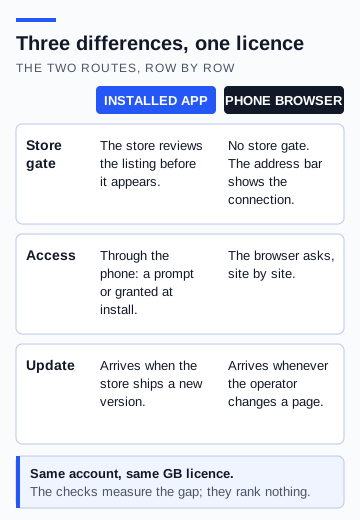
Is it better to use the casino app or the website? Ten checks, measured on a phone
An installed app and a browser tab reach the same licensed operator by different routes. Ten checks, each with a measurement and a pass line, separate what actually changes from what is only assumed to.
Read Is it better to use the casino app or the website? Ten checks, measured on a phone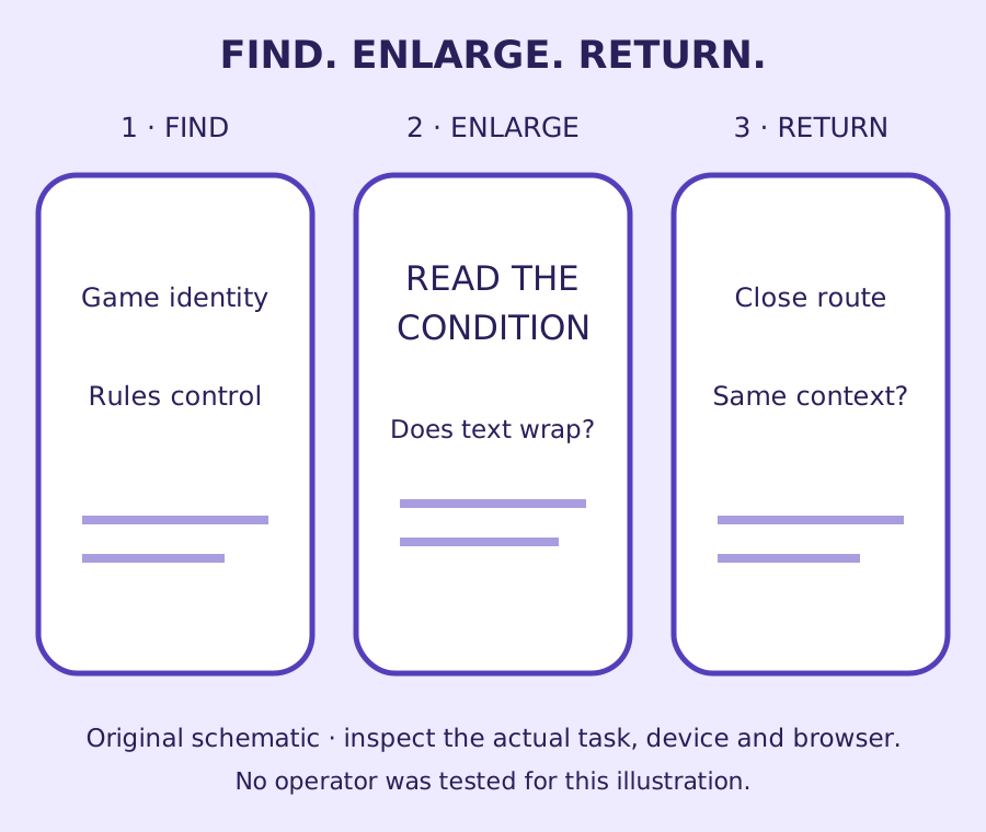
How do you check whether a mobile casino page is usable?
Follow a rules-reading task through touch, zoom and orientation, with a clear observation record and an interactive target-size illustration.
Read How do you check whether a mobile casino page is usable?
Continue reading
Does deleting an app remove all its data?: measured on a phone, with the method
Deleting a casino app removes the app; it does not remove the account, the deposit limit or the record the operator holds. This bench reads the Google Play, Chrome, Apple and Gambling Commission pages that say where each piece of data lives, and sets out the inspection sheet so anyone can run it on a named app.
Read Does deleting an app remove all its data?: measured on a phone, with the methodWhat your phone can tell you about a casino app’s permissions
A repeatable inspection separates what an app declares, what you allow and what the phone records, with a worked example that makes no claims about a named casino.
Read What your phone can tell you about a casino app’s permissionsCan you reach casino account controls with one hand?
A repeatable inspection method for reach, grip changes and unintended touches, with WCAG checks kept separate from personal comfort.
Read Can you reach casino account controls with one hand?Run a mobile interface inspection
Small buttons deserve a clear test
Is it better to use the casino app or the website? Ten checks, measured on a phone
What your phone can tell you about a casino app’s permissions
Does deleting an app remove all its data?: measured on a phone, with the method